Analyze This: How hot will it get?
Temperatures are rising because of human-caused climate change

Because of climate change, it’s getting hotter across the globe.
Ahmadmahmood/iStockphoto
Global temperatures have risen by an average of 1 degree Celsius (1.8 degrees Fahrenheit) since 1850. That’s when people began using fossil fuels in high quantities to provide energy. Burning that coal, oil and natural gas boosted the amount of greenhouse gases entering the atmosphere each year. That has added to the thermal “blanket” surrounding the planet. With a heavier blanket, temperatures on the ground began to rise. And it will continue to get warmer in the coming years and decades.
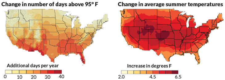
There are a number of different ways to see the effects of those rises in average temperature. One is by comparing the number of days each year that reach 35° Celsius (95° Fahrenheit) or higher. Another is looking at average temperatures for a single season, such as summer.
But just as weather isn’t the same from place to place, temperatures have been rising at different rates in different places. Temperatures in Alaska, for instance, have been rising twice as fast as those across the rest of the globe.

Data Dive:
1. Read the caption. Find your state (or pick a U.S. state if your state isn’t shown or you live outside the United States). Explain what each map tells you about that state. Be as detailed as possible, give appropriate units and explain the timeframe of the data shown.
2. Look at the map labeled “Change in number of days above 95˚ F.” Do you notice any general trends for different parts of the country? Describe them.
3. Look at the map labeled “Change in average summer temperatures.” Do you notice any general trends for different parts of the country? Where will temperatures rise the most? Where will they rise the least?
4. What is the overall purpose of these visualizations? Why are they paired together here? Is one map more effective at communicating the overall temperature trend than the other? Explain.
5. What information is missing from these maps that you would like to know? Explain.
Analyze This! explores science through data, graphs, visualizations and more. Have a comment or a suggestion for a future post? Send an email to sns@sciencenews.org.


