Snot Science: Results are nothing to sneeze at
This is how we analyzed the data we collected squirting thick and thin snot
I’ve got a hypothesis and data to back it up. How do I know if I got a difference?
Explainr
This article is one of a series of Experiments meant to teach students about how science is done, from generating a hypothesis to designing an experiment to analyzing the results with statistics. You can repeat the steps here and compare your results — or use this as inspiration to design your own experiment.
Being sneezed on is pretty gross. But it’s “snot cool” (get it?) for another reason. Mucus in sneezes can contain viruses that cause colds and influenza. That leaves us wondering: How far away should you be from a sneezer to make sure you don’t end up sick?
In our first-ever DIY Science video, I show how I conducted an experiment to answer that question. And in our first, related blog post, I gave you all the methods and tools needed to do this experiment yourself. But once you’ve taken all your measurements, how do you figure out what your data mean? I’ll show you how here.
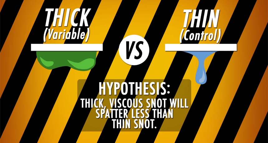
In my experiment, I created thin mucus from colored water and thick mucus with a combination of water, gelatin and corn syrup. I took my two types of faux mucus and squirted them onto a tarp with a plastic dropper. This created a model of a sneeze. My hypothesis was that thin mucus would fly farther than thick mucus. To account for the fact that each “sneeze” would not be exactly the same, I squirted each type of fake snot 26 times.
Before I started squirting, I carefully marked a distance of 5 meters (500 centimeters, or nearly 200 inches) on my tarp and divided it into segments a half meter (50 centimeters, or almost 20 inches) in length. The food coloring I added to my fake mucus helped me see exactly where my snot had spattered.
For each squirt, I wrote down how far the farthest droplet flew, a measure I called the “maximum distance” of the sneeze. I also counted the number of drops of snot in each half-meter segment of my tarp. This would allow me to calculate where the thick and thin snot concentrated.
I loaded all of my data into a spreadsheet. We’ll start with the maximum distance for thick and thin snot, which I’ve included below.
Story continues below table.
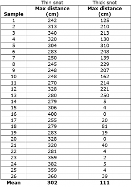
That looks like some big columns of numbers. But how do we know if one group is different from the other? First, we need to find the mean — the average total distance — for each type of snot spattered. To do that, I add up all the distances for one group (say, thin snot), and divide by the number of samples I took — 26. My result is 302 centimeters (about 119 inches), which is about 3 meters (or 9.8 feet). The mean of my thick snot is 111 centimeters (44 inches), which is a little over a meter (3.3 feet).
So it seems like the thin snot traveled quite a bit farther than the thick snot, right? After all, 302 is much bigger than 111. But these two numbers are averages. If you look at the data points for thin and thick snot, you’ll notice that they vary a lot. My thin snot flew as little as 240 centimeters (94 inches). Some of the samples of my thick snot flew farther than that. So we have to ask: Are my two groups really substantially different?
To find out, we need run some statistical tests — ways to analyze groups of data to determine their meanings. I’ll start with a t-test — a test that is used to figure out the difference between groups. The t-test can tell me whether my two groups are indeed different. However, it won’t tell me how big or important the difference is. So I will also use the t-test to figure out a number called Cohen’s d — a measure of effect size. The effect size is a measure of how big my difference is.
There are many free websites that will let you perform a t-test. I used this one. It allows me to enter my individual data points in columns.
When I entered all my data, the online calculator gave me a p value. This is the probability of seeing a difference between my two snots as big or bigger than the one I would get by accident, when no difference really existed. In this case, the p value is less than 0.0001. This means there’s a 0.01 percent chance that I observed a difference between my groups that didn’t really exist. Scientists refer to p values below 0.5 — or a five percent chance of getting a result by accident — as being statistically significant.
But is the difference between the thick snot and thin snot a large one? How different are the two snots? To find out, I need to find the effect size. I used the free calculator here. To make the calculation, I enter the mean for each type of snot, the number of times I ran each type (26) and the standard deviation for each group. This is a measure only of how my much my data spread around my mean. I can calculate that in an Excel spreadsheet for each group of my data using the function “=STDEV” and including all the points for one type of snot. (For more details about calculating standard deviation, see another of my blog posts here.)
Story continues below image.

When I put those numbers into the calculator, I get an effect size of 2.395. Generally, scientists assume that anything below 0.2 is a small effect size. A Cohen’s d value of 0.5 is medium, and anything above 0.8 is large. So our Cohen’s d of 2.395 is actually huge! This means there’s a big effect of mucus thickness on how far the snot flies.
But these aren’t the only data I collected during my experiment. I also counted the number of snot drops that fell every half meter. This let me determine where the thick snot and thin snot concentrated. A single drop of snot might have traveled several meters (or yards), but that might not be a good measure of how far most of the drops flew. They may have landed much closer to the dropper.
Here you can see the data for how many drops fell per half meter (20 inches) of tarp:
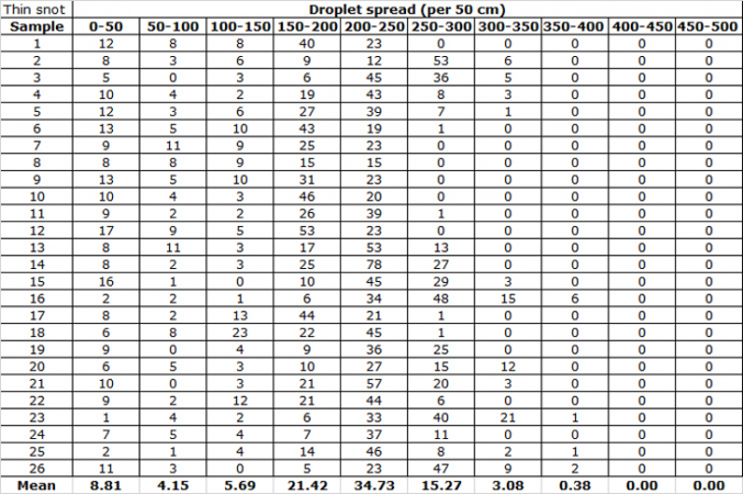
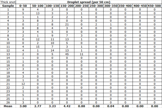
I took the means, calculated the standard deviation and created a graph to compare how the thick snot and the thin snot spattered.
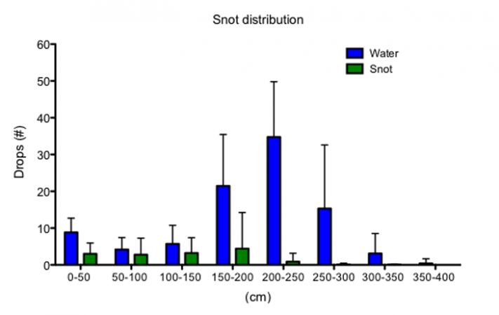
You can see from the graph above that the thin snot spattered farther than the thick snot. The water also spattered into many more drops. The thick snot had few drops and tended to land closer to the dropper.
So far, the results of our experiment show that thick snot doesn’t shoot as far as thin snot. But the best scientific results don’t stand alone. In this next post I’ll look at other scientists who have studied snot spatter, and show you how to take this experiment and make it your own.
Follow Eureka! Lab on Twitter


