Analyze This: Not all races saw equal improvements in this air pollutant
Levels of NO2 in air fell overall from 2000 to 2010, but not equally for all neighborhoods

U.S. levels of nitrogen dioxide (NO2), a common traffic-related air pollutant, have fallen. However, neighborhoods where most residents are people of color tended to see the smallest improvements, new data show.
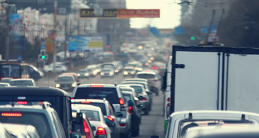
Kichigin/iStockphoto
On average, people in the United States were breathing lower levels of a common air pollutant in 2010 than 10 years earlier. That’s the conclusion of a new study. It compared how pollution levels and the racial makeup of residents varied by neighborhood. And it did that for every neighborhood in the continental United States. To do this, scientists used data from the U.S. Census, from satellites and from air-quality stations.
The pollutant, nitrogen dioxide (NO2), can cause breathing problems. So a decrease is good news. However, the study also found that people of color tended to be exposed to more of this pollutant than were whites at both time periods.
Story continues below video.
This surprised researchers. “There are [differences] in exposure to air pollution that are persisting over time,” says Lara Clark. She is a graduate student in engineering at the University of Minnesota in Minneapolis. Her team published its findings September 14 in Environmental Health Perspectives.
Air pollution can have a direct impact on health. NO2, in particular, irritates the lungs. So breathing it can worsen lung diseases, such as asthma. This pollutant also can cause coughing, wheezing and difficulty breathing.
The main source of NO2 in U.S. air is the burning of fossil fuels. Vehicles powered by gasoline or diesel fuel often are the most common source of this pollutant. This tends to be especially true in cities. Previous research had suggested minority groups and people in low-income households were most likely to live near roads with the most traffic, and therefore the most NO2.
Because NO2 can harm health, governments have acted to cut how much is emitted into the air. Clark’s team wanted to measure how effective U.S. programs had been.
They started by creating a computer program to estimate air pollution from 2000 to 2010 on the neighborhood scale. This computer model combined satellite, air-quality and land-use data (information on where there are roads, houses and businesses) to estimate local pollution levels. The program also used census data to identify the race of the residents in each neighborhood.
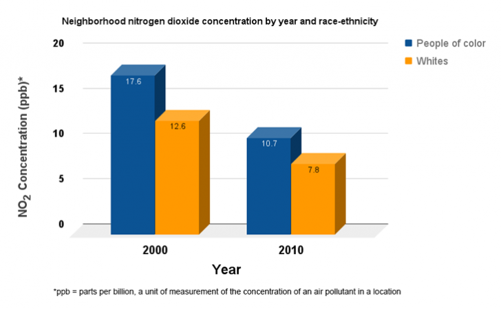
Exposure to NO2 decreased for all neighborhoods, the data show. However, neighborhoods that were majority white tended to see bigger reductions in NO2 levels than did those where a greater share of the residents were people of color.
“When it comes to how much NO2 a person breathes, it’s still race that matters most,” says study author Julian Marshall. He is a civil and environmental engineer at the University of Washington in Seattle.
Marshall says that this team’s work could provide the know-how to help provide environmental improvements that would help everyone equally.
| NO2 concentration in parts per billion (ppb) | 2000 | 2010 |
|---|---|---|
| People of color | 17.6 ppb | 10.7 ppb |
| Whites | 12.6 ppb | 7.8 ppb |

Data dive:
1. How did exposure to NO2 increase or decrease for each group of people from 2000 to 2010?
2 How much more NO2, by percentage, polluted neighborhoods in 2000 where a majority of residents were people of color? What about in 2010?
3. As seen in the video, researchers also studied variables such as age, education level, income level and race or ethnicity. Can you think of other variables that might be useful for comparisons in such a study?
Beyond the data:
1. Low-income people and people of color are more likely to live near major roads, with more traffic — and therefore more pollution. Why is this? In a group, brainstorm to come up with a list of at least three possible reasons.
2. The engine in an electric car does not produce the same air pollution that a gasoline-powered engine does. The number of electric cars is expected to increase in the future. How might this affect air pollution levels? Will the inequalities from one neighborhood to another that exist today still be likely to exist 10 years from now (assuming most people do not move)? Explain your reasoning.
______________________________________________________________________
Analyze This! explores science through data, graphs, visualizations and more. Have a comment or a suggestion for a future post? Send an email to sns@sciencenews.org.


