Analyze This: Climate change could make food less healthy
Levels of nutrients fell as plants breathed in more carbon dioxide

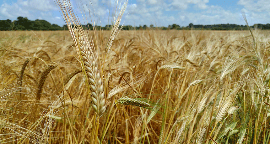
More carbon dioxide in the atmosphere may lead to wheat and other major crops becoming less healthful.
KTTrainer/pixabay (CC0)
As levels of carbon dioxide — CO2 — in the atmosphere have been rising in recent decades, Earth has been warming. That’s because as a greenhouse gas, CO2 traps heat in Earth’s atmosphere. That warming is one symptom of climate change. And it has the potential to affect food in many ways. Rising temperatures and the changes in rainfall that it will bring should impact how much and where crops grow. Data now show that rising levels of CO2 also can affect how nutritious a crop will be. Some of those data were reported last year in Annual Review of Public Health. Indeed, it noted that several studies have come to this conclusion.
Samuel Myers is an environmental health scientist at Harvard University in Cambridge, Mass. He was part of a team that has studied the potential effects of climate change on nutrition. In one 2014 study, his group looked at six major food crops: wheat, rice, field peas, soybeans, maize (corn) and sorghum. They exposed plants to different amounts of CO2. Some got levels of between 363 and 386 parts per million (ppm). Such concentrations were typical at that time. (CO2 levels have since risen.) Other plants were exposed to more of that greenhouse gas as they grew — 546 to 586 ppm. Such levels are expected to develop within the next 50 years or so.
After harvesting the plants, the researchers measured their levels of vitamins, minerals and other nutrients. And plants grown with more CO2 were less nutritious. For instance, wheat and rice had lower protein levels. They also had less zinc and iron, as did the peas and soybeans. Some two billion people worldwide already don’t get enough of these minerals. Most people depend on cereal crops, such as wheat and rice, to meet their dietary needs for both zinc and iron. If crop levels of such nutrients fall, people may face an even greater risk of falling ill.
People who substitute sugars and starches for protein face a greater risk of high blood pressure and heart disease, U.S. studies have shown.
Scientists don’t yet know why CO2 impacts levels of these nutrients. But the new findings suggest scientists may want to try breeding new varieties of crops that are less affected by CO2. That way people will still get the most benefits from their greens and grains.

Data Dive:
Analyze the graph and answer the questions below:
- A scatter plot is a set of data points plotted along vertical and horizontal axes. Does this graph count as a scatter plot? Why or why not? What is another type of graph that could be used to display these data? Explain your answers.
- Analyze the variables represented on the x-axis and y-axis in the graph.
- Name the dependent and independent variables.
- What do the negative numbers on the y-axis represent?
- How much higher were zinc levels in wheat exposed to elevated CO2 levels? What is the approximate percent change in zinc content for wheat? What is the difference in protein between plants that were exposed to normal levels of CO2 and those exposed to elevated levels? What is the approximate percent change in protein for soybeans?
- Consider the data represented on the graph: Why are both positive and negative numbers included on the y-axis?
- If you excluded soybean data from the graph, how could you change the range of values and the description of the trends seen on the y-axis?
- The lines above and below each point on the graph are known as error bars. Because no experiment will ever be perfect, an error bar is a line through a point on a graph which shows the degree of uncertainty or variation in findings. Error bars help to represent the overall range of data. The error bars on this graph represent 95 percent confidence intervals. Each confidence interval covers a range of values. The true value — how much nutrition is really in the crop — is likely to be within that range. When a confidence interval is described as “95 percent,” it means that 95 out of 100 times, the data that a scientist collected would fall between the bars. So the error bars on this graph represent what scientists could expect to find 95 times out of every 100 times that they measured the nutrients
- In rice, compare the percent change in zinc, iron and protein between plants grown in normal and in elevated levels of CO2. For which nutrient are the error bars on the graph greatest? For which nutrient are they smallest?
- Imagine you were to run another trial for the iron and protein levels in rice exposed to elevated CO2. Would you expect the average values that you measured to lie between the error bars on the graph for each nutrient? Or would you expect it to lie outside of the error bars? Explain your answer.
- What does each point on the graph represent? Based on the graphed data, what is the approximate percent change in zinc content for wheat? How about for rice and soybeans? Can you say with confidence that the percent difference in zinc for wheat is larger than its percent difference in soybeans? Explain. Can you confidently say that the percent difference for zinc in wheat is larger than its percent decrease in rice? Explain.
Analyze This! explores science through data, graphs, visualizations and more. Have a comment or a suggestion for a future post? Send an email to sns@sciencenews.org.


