Analyze This: Flu vaccine’s protection varies
A flu shot can’t totally prevent you from getting sick — still, a yearly shot makes good sense

Getting the flu is no fun, but a yearly vaccine can help keep you from getting sick.
samotrebizan/istockphoto
Every winter, flu season rolls around. Ads telling you to get your flu shot show up everywhere. Vaccination may not seem that important. But influenza is more than just a bad cold. In the United States alone, it can kill several thousand people in any given year — and sometimes tens of thousands. Those most at risk of side effects (including death) are the very young and very old. Getting a flu shot makes sense even for people at low risk, however. Not only can they protect you, but they also limit your ability to spread the infection to vulnerable people around you.
Unfortunately, getting a shot won’t guarantee you can’t come down with the flu. That’s because the vaccine is never 100 percent effective. What’s more, how well it works can vary widely from one year to the next. The reason? A vaccine is only created to protect against a few strains of flu virus. Months before each flu season, the World Health Organization recommends three or four strains to include in the coming year’s vaccine. Each country then decides which of those strains it will target in its vaccine. In the United States, the Food and Drug Administration has the final word. If this agency guesses right and the strains in the vaccine match those spreading around the most people, the vaccine can be especially effective.
Even during a good year, though, that might not mean everyone who gets a shot will stay healthy. During the 2015-2016 flu season, for instance, only about half of all people who got a vaccination were protected. That’s the finding of a study in the August 10 New England Journal of Medicine.
A team of doctors looked at people at least 6 months old who had been vaccinated during the 2015-2016 flu season. Some received vaccines that had a “live” virus. (This vaccine is safe and won’t give someone the flu because the virus has been weakened.) Others were given vaccines that had an inactive (or “killed”) form of the virus.
The new data now show that the type of vaccine proved particularly important in how well it protected young people. Among children ages 2 to 17, the inactive virus was much more effective. It protected 12 in every 20 kids that got a flu shot. The one that used a live virus, in contrast, protected only one in every 20 kids. As a result, the U.S. Advisory Committee on Immunization Practices recommended not using live-virus vaccines this year.

Data Dive:
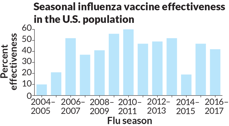
- What is the approximate percent (%) effectiveness of flu vaccines in each year from 2004 to 2016? Round your answer to the nearest 5 percent.
- Make a list of the values shown in the graph, putting them in order from the lowest to highest. Identify the median for this data set, and calculate the mean (also known as average). Count how many numbers are in your data set and divide the list into quartiles (four equal parts). Now create a box and whisker plot (a diagram that displays the distribution of data) by drawing a line long enough to contain all of your data, marking numbers at even intervals along the line. Next, mark the median on the line you just drew, along with the upper and lower quartiles. Make a box by drawing horizontal lines connecting the quartiles. Then mark the endpoints (the numbers with the lowest and highest values in your data).
- Looking at the shape of the plot you created, what can you tell about the spread of those data (are the data evenly spread out, or do they clump somewhere)? Hint: determine the range (difference between the highest and lowest values) in each quartile.
- What does the spread of the data in the bar graph tell you about the general trend of how well vaccines worked between 2004 and 2016 (their percent effectiveness)?
- Compare the mean and median for this set of data. If there are outliers, will the mean or median better represent the general trend in those data? Explain.
- According to the text above, why does how well a vaccine works (its percent effectiveness) vary each year?
- Critique the graph. What would you do differently? What information do you feel could be added to the graph to make it more useful or easier to understand?
Analyze This! explores science through data, graphs, visualizations and more. Have a comment or a suggestion for a future post? Send an email to sns@sciencenews.org.


