Analyze This: These viruses are behemoths
Don’t worry, though, since giant viruses target amoebas, not people

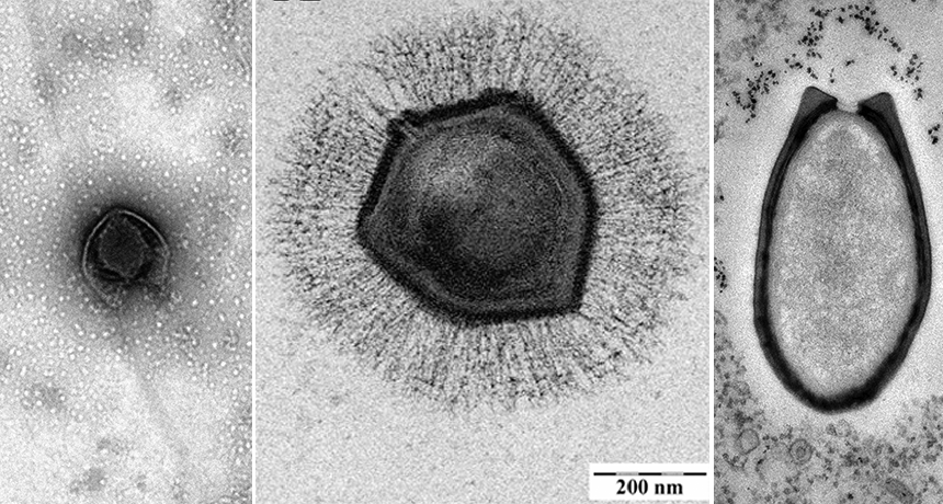
Three giant viruses are shown here (from left to right): Pacmanvirus, Mollivirus and Pandoravirus
J. ANDREANI ET AL/J. OF VIROLOGY 2017; E. GHIGO ET AL/WIKIMEDIA COMMONS (CC BY 2.5); © IGS CNRS, AIX-MARSEILLE UNIV.
Usually viruses are thought to be teeny tiny. After all, they invade cells. And cells are pretty tiny themselves. But viruses can vary greatly in size. Some are almost as big as bacteria. These so-called gigantor viruses carry a lot of information within what is also a relatively large amount of genetic material. Depending on the virus, those data are coded within its DNA (or its single-stranded cousin, RNA).
The good news: Humans aren’t on a gigantor’s menu. These viruses usually prey on single-celled organisms called amoebas.
To date, scientists have found around 10 potential families of mega-viruses. Many take the shape of multi-sided capsules or egglike ovals. However, there are some exceptions. Mollivirus is roughly spherical. Pacmanvirus (leftmost image, above) has an outer shell that resembles its namesake.

Data Dive:
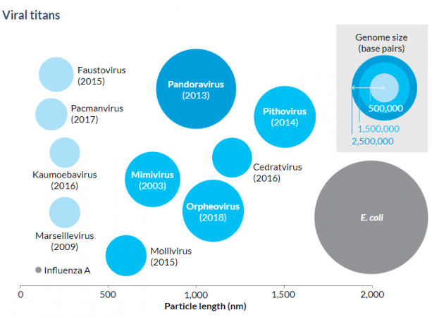
- What types of viruses do the diagram and text highlight?
- What three key pieces of information about the highlighted viruses are shown in the “Viral titans” diagram? Explain how each piece of information is displayed in the diagram. Don’t forget to include units, where appropriate.
- What information can be drawn by including a comparison to influenza A in the diagram?
- Why is the circle representing influenza A so small?
- According to the diagram, what is the particle length of influenza A? Roughly how many base pairs does it contain? What about for the Mimivirus?
- What is the approximate particle length of the E. coli bacterium? According to the diagram, how big is its genome?
- What information can be drawn by including the comparison to the E. coli bacterium?
- The genome of E. coli is large. The number of base pairs runs in the millions. Can you tell from looking at the diagram what the actual number is? How well does the diagram display that type of information?
- Why do you think the diagram does not give base-pair information specifically for influenza A or E. coli? Would you add that information to the diagram? Explain your reasoning.
Beyond the Data:
- What is the overall purpose of this diagram? How could it be modified to better align with that purpose?
- How could you redesign this diagram to show the same data? Be creative, and sketch your new diagram.
____________________________________________________________________________
Analyze This! explores science through data, graphs, visualizations and more. Have a comment or a suggestion for a future post? Send an email to sns@sciencenews.org.


