Earth as you’ve never seen it before
New two-sided map appears to be most accurate ever

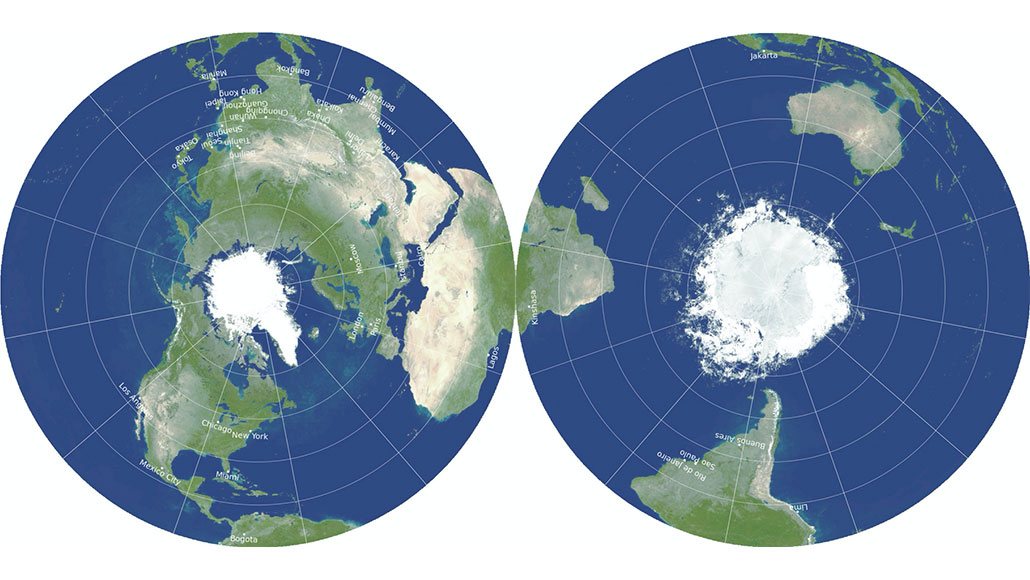
Maps always contain distortions, and the larger the area they display, the more obvious those distortions become. But a new technique rendered the round maps here with the fewest distortions ever, its developers say. Distances can be measured between any two points, sometimes by crossing to the other side.
J.R. Gott, R. Vanderbei and D. Goldberg
When cartographers — people who make maps — set out to portray the Earth, they have to turn a 3-D sphere into a 2-D map. And that’s a lot harder than it sounds. Smooshing the globe into a flat image usually distorts lots of surface features. Some expand. Others shrink, sometimes by a lot. Now three scientists have come up with a clever way to limit those distortions.
Their big trick? Divide the map onto two pages.
“Wow!” said Elizabeth Thomas on learning of the new map. Thomas is a climate scientist at the University at Buffalo in New York. She says maps made the new way could be very useful. For instance, it better conveys to scientists, like her, who study the Arctic, how far this area is from other places on the planet. It shows how really vast the Arctic is, too.
“Anything that involves visualizing data on maps will be easier with this new type of projection,” she says. “This includes things like changes in ocean currents. It could also help see the average position of atmospheric fronts, like the polar vortex.”
Displaying size differences
A drawing of a curved object (such as Earth’s surface) onto a flat piece of paper is called a projection. Over the centuries, mapmakers have come up with many different types. All distort the relative size of Earth’s features.
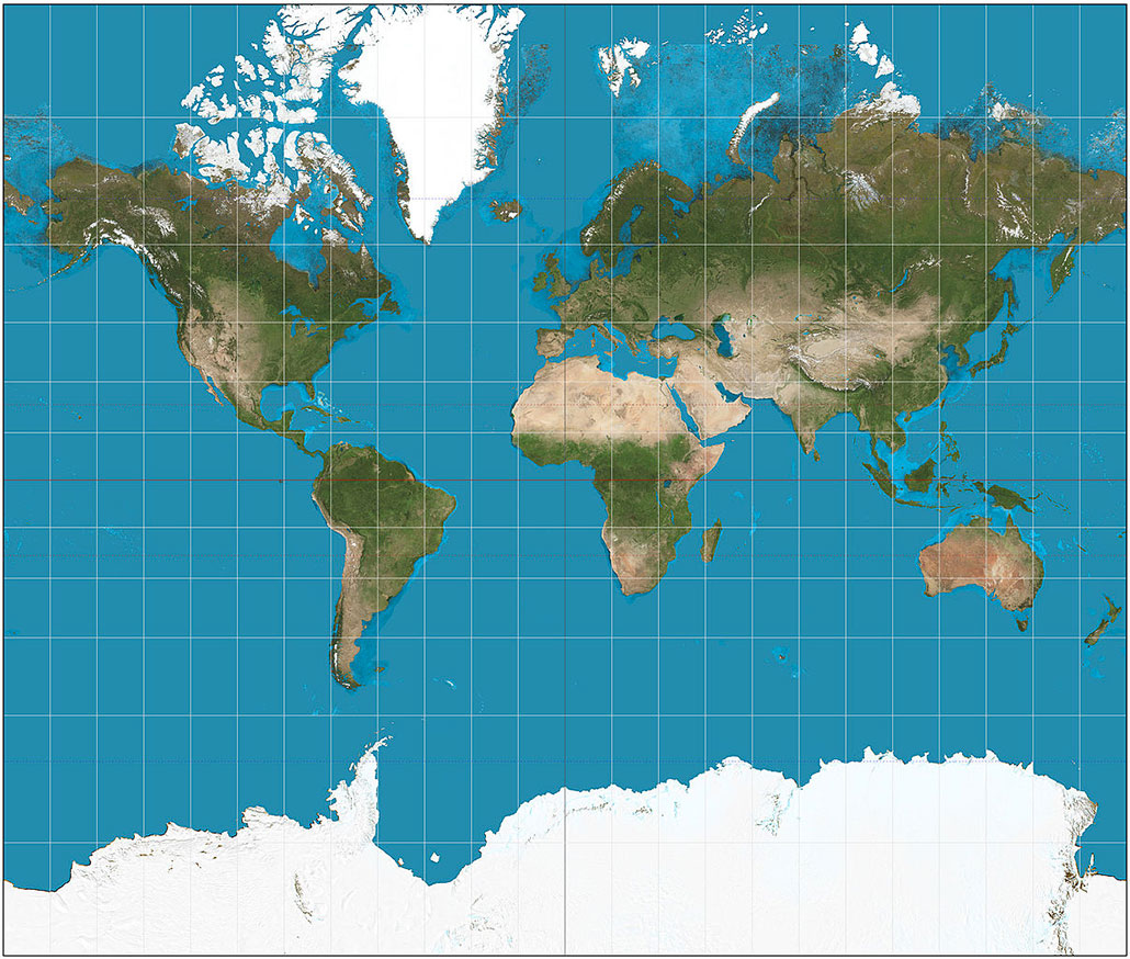
The most common map used these days is the Mercator projection. It’s may even be on your classroom wall. Though good, it has problems. Parts farthest from the equator look much bigger than they really are. Greenland looks bigger than Africa, for instance, yet is just seven percent its size. Alaska looks about the same size as Australia despite being less than one-fourth as big.

Some projections also distort the distances between places. To make a flat map from a round globe, you have to cut the image somewhere. This means the map stops at the edge of the paper, then takes up again on the far edge of the paper. Known as a boundary problem, it creates the impression of big spaces between places that are actually closer together. For example, Hawaii is much closer to Asia than it looks on a Mercator projection.
No one projection is necessarily the best. The Mercator projection is very good for navigation and for making local maps. Google uses a form of it for city maps. Other projections might do a better job with distance or with the size of continents. The National Geographic Society uses the Winkel tripel projection for its world maps. But no map perfectly portrays the whole planet.
Still, many people would prefer a map with the fewest distortions. And that’s what three scientists appear to now offer. They posted a paper describing their new mapmaking technique February 15 on ArXiv. It’s an online database of scholarly articles.
Why just one page?
J. Richard Gott and David Goldberg are astrophysicists. Gott works at Princeton University in New Jersey. Goldberg studies galaxies at Drexel University in Philadelphia, Penn. When Goldberg was in graduate school, Gott was one of his teachers. About a decade ago, the two developed a system for scoring the accuracy of maps. They based scores on six types of distortion. A score of zero would be a perfect map. The Winkel tripel projection scored the best. It earned an error score of just 4.497.
A few years back, Gott phoned Goldberg with an idea: Why does a world map have to be only on one page? Why not split the globe, projecting each half on a separate page? Robert Vanderbei, a mathematician at Princeton, joined the pair on this. Together, they created a radically different map. It has an error score of only 0.881. “Compared to the Winkel tripel, our map improves on every category,” says Goldberg.
Their projection sticks two circular sheets, each a flat disc, back to back. It shows the Northern Hemisphere on one side, the Southern Hemisphere on the other side. One of the poles is at the center of each. The equator is the line that forms the edge of these circles. In a February 17 article in Scientific American, Gott describes it as if you’d taken the Earth and squashed it flat.
“Distances between cities are measured by simply stretching a string between them,” Gott explains. To make measurements that cross a hemisphere, pull the string across the equator at the edge of the map. This new projection, Gott says, would let an ant walk from one side to the other without ever touching a spot that didn’t represent a real spot on Earth. So it totally gets rid of the boundary problem.
And this projection isn’t just for maps of Earth. “It can be any roughly spherical object,” Goldberg points out. Vanderbei has already made maps of Mars, Jupiter and Saturn this way.
Something for everybody
The ArXiv post on the new approach to mapping spheres was not peer reviewed. This means other scientists have yet to judge it. But Thomas is not the only scientist excited about its prospects.
“I think it would be really neat to make a version of the map that shows the arrangements of the continents in periods such as the Triassic and the Jurassic,” says Nizar Ibrahim. He’s a paleontologist in Michigan who works at the University of Detroit. This new projection, he says, “could help students better understand how landmasses and our planet changed over time.”
Licia Verde works at the Institute of Cosmos Sciences at the University of Barcelona in Spain. She says the new map would help better visualize “the surface of other planets — or even our own night sky.”
The only drawback to the new projection: You can’t see all of Earth at once. Then again, you can’t see all of our actual planet at one time either.


